
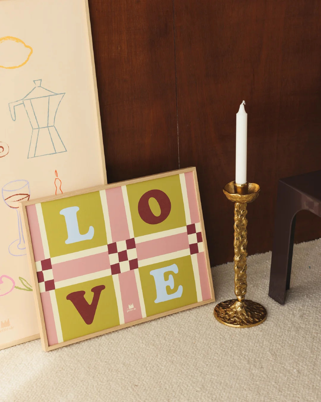
Which poster for which wall? The room-by-room plan to transform your interior
Why the wall you look at every morning deserves better than a generic poster
We all know that moment. You've just moved in or repainted the living room, and there... the wall stares back at you. Empty. A little accusatory. You go to a superstore, grab something that "does the job," and three months later, you find it at your neighbor's house. Classic.
What's reassuring? A bad choice of wall art print rarely comes from a lack of taste. It comes from a lack of method. We start with the print, when we should start with the room. Its constraints, its use, its light. Once we change the starting point, everything becomes simpler.
This is exactly what this article offers you: a concrete plan, room by room, to transform your wall decoration without making mistakes. And if you already want to explore formats and styles designed for each space, take a look at our selection of prints. Shall we begin?
The living room: the room where the wall print must hold the conversation
The living room is the room that speaks for you when guests arrive. And a wall print that's too small on a large wall whispers when everyone expected a statement.
Here's the thing no one tells you: in a living room, the viewing distance is 3 to 4 meters. A 30x40 format completely disappears. Go for at least 50x70 cm, or compose with two or three prints in complementary formats (40x50 + 30x40, for example). The result is immediately more structured and intentional.
Styles that work well: bold typography, colorful illustration, graphic nature print with strong shapes. The idea is for the eye to be drawn from across the room. Think of our Happy Place print.
Before hanging anything, test with a piece of kraft paper in the desired dimensions. Attach it to the wall with masking tape. Step back. You'll immediately see if the format is appropriate. This simple and silly trick avoids 80% of errors.
White wall + light parquet + a decorative print with strong graphics = immediate effect, without effort. That's the kind of impact a good living room decorative poster aims for.
The master bedroom: an ambiance to create, not just a wall to fill
The bedroom is your sanctuary. The last place you see at night and the first in the morning. So your wall decoration should be soft and intentional.
Real constraint: the light is often grazing (north-facing bedrooms are common), and you look at the print from the bed, so at a short distance. This changes everything in the choice of pattern.
Forget the cluttered gallery here. A single focal point, well chosen, well centered (or slightly above the headboard line), is much more restful for the brain. Environmental psychology studies show that visual overload in the sleeping space harms the quality of rest. You don't need much: you just need to choose wisely.
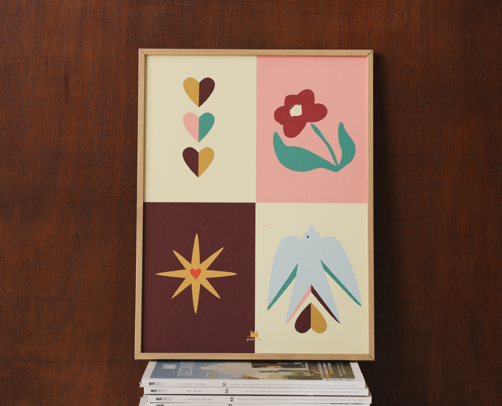
In terms of format, 40x50 or 50x70 works perfectly. As for style: soft tones, calming subjects, light typography, or graphic poetry.
And the framing matters as much as the print itself. A framed print in light wood brings warmth, a thin metal frame plays the minimalist card. Both can transform the same visual into two totally different ambiances.
The children's room and the kitchen: two rooms where a print can change everything
For the children's room: the classic mistake is to choose a print that's too "babyish" and will be outgrown in 18 months. And there, it's back to square one. The key is evolvability.
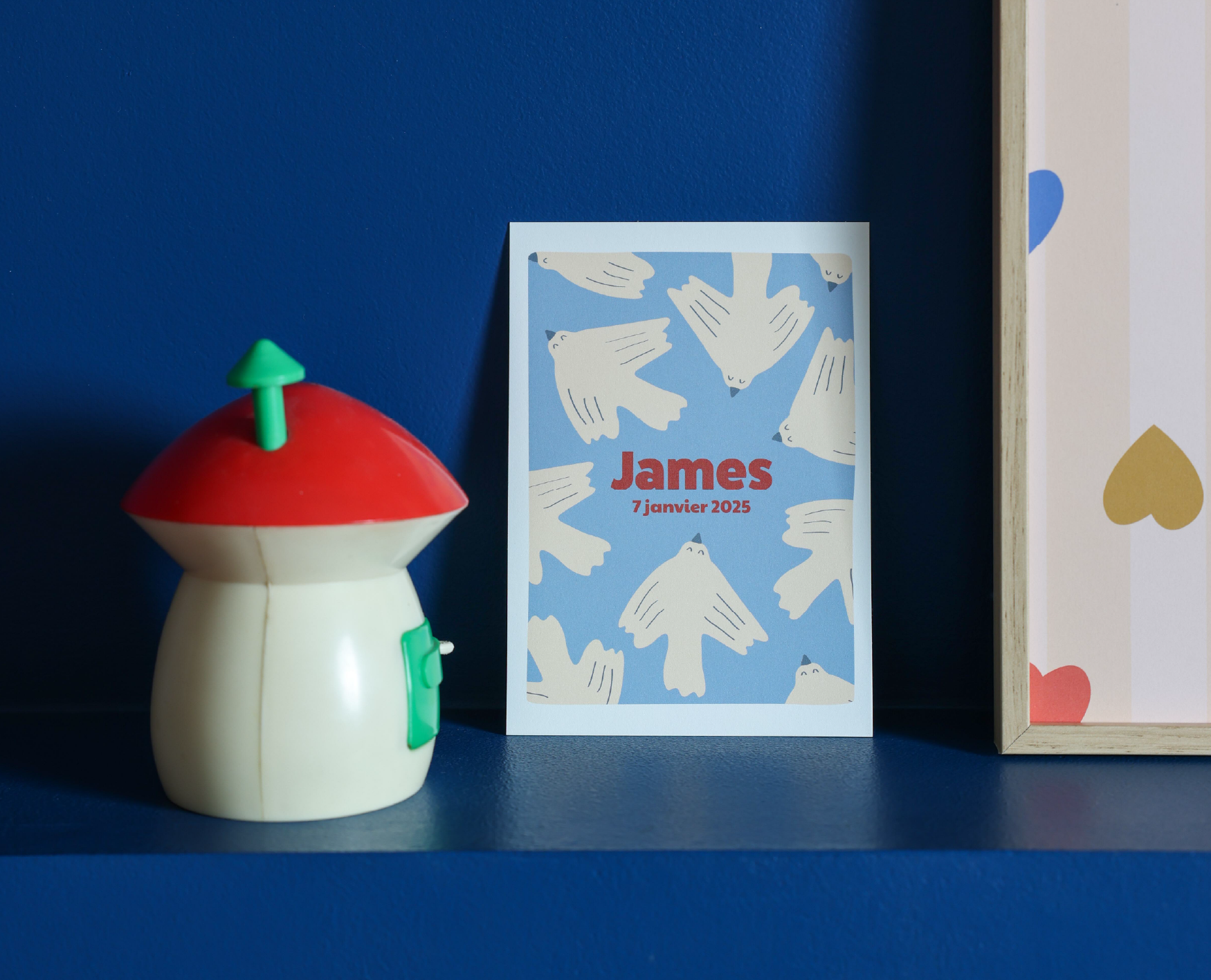
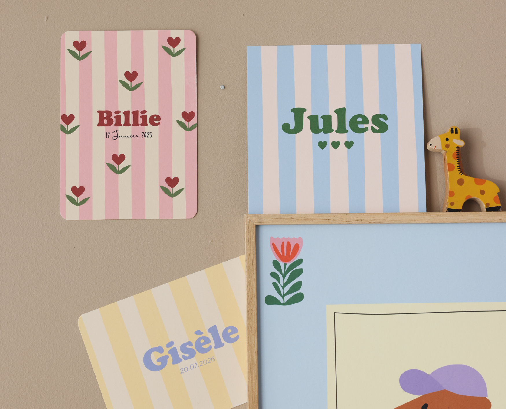
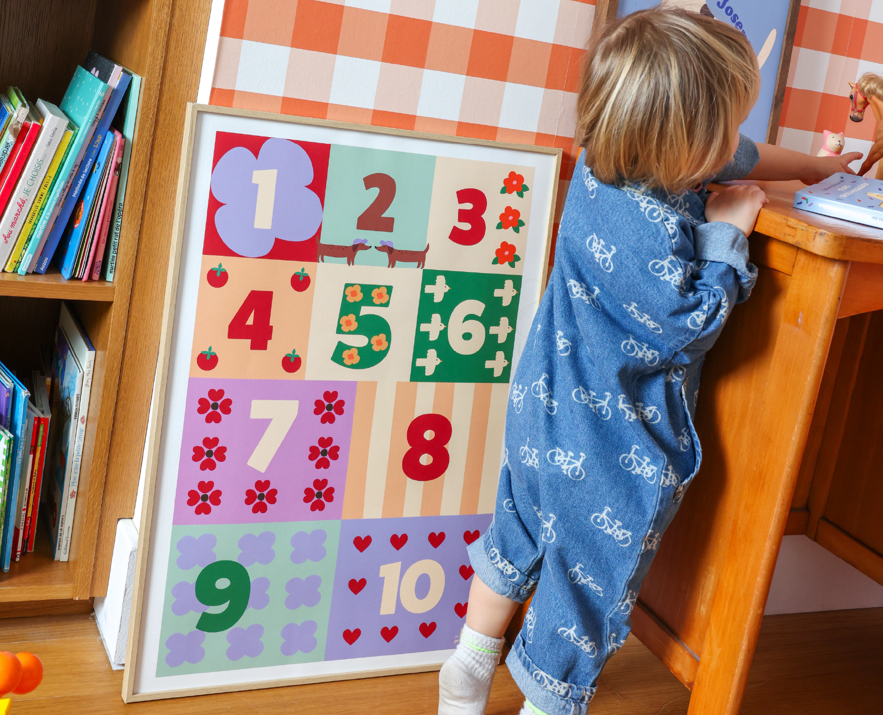
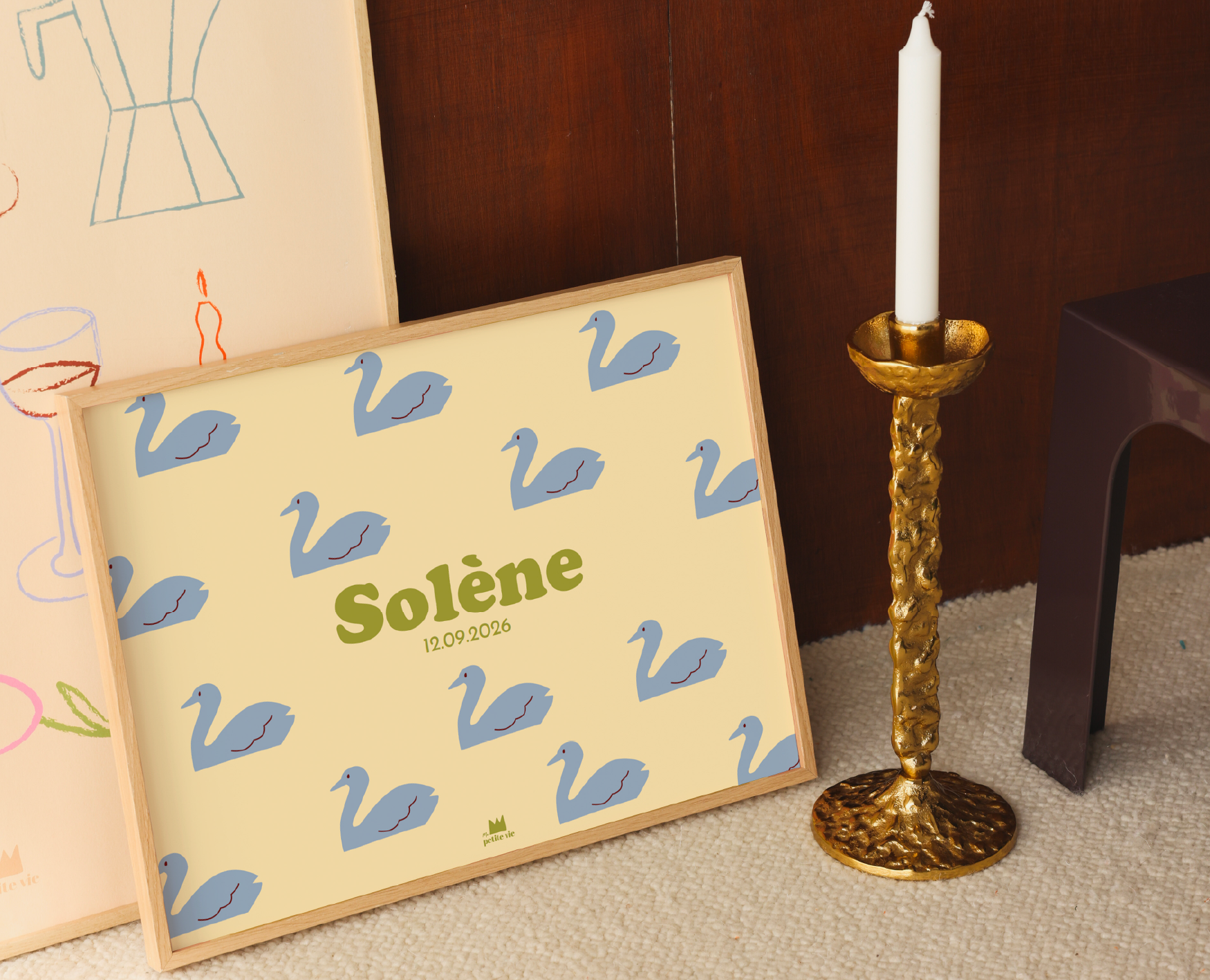
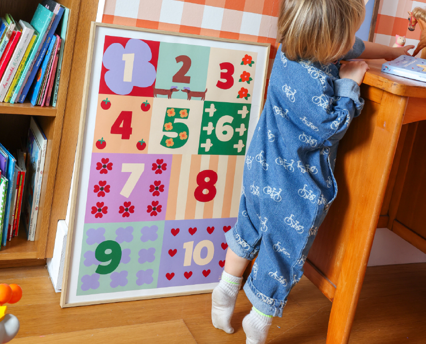
Also consider hanging height: at a child's eye level, not yours. Ideal format: 30x40 or 40x50 depending on the room size. And if you want to create a real attachment, a personalized print with the child's name is unbeatable. It grows with them, remains relevant at 3 years old as at 10 years old, and creates a space that truly reflects them. Fall for our animal prints or our large educational prints, for example.
For the kitchen: the constraints are more technical. Humidity, vapors, walls fragmented by furniture and equipment. A few simple rules: avoid hanging too close to the hobs, and prefer a quality paper print that better resists the ambient atmosphere.
The kitchen is often the most neglected space in terms of wall decoration. This is a shame, because a beautiful graphic print can transform this functional corner into a true personal gallery. A culinary-themed decorative poster or one with everyday objects resonates particularly well in this space, and instantly gives character to a room that is often too conservative.
Office and hallway: the forgotten rooms that make all the difference
The office, you gaze at it for hours every day. The wall in front of you might as well inspire you instead of depressing you. A typographical wall print with a short quote or a minimalist visual works wonders: stimulating without distracting, decorative without being cluttered. Recommended format: 30x40 or A3, sober and legible even under artificial light.
The hallway is the other great forgotten space. And yet, it's the first thing you (and your guests) see when entering. Be careful, however, of the classic mistake: a large print in a narrow hallway gives the impression of closing off the space. Prefer smaller vertical formats, 21x30 or 30x40, or a series of three prints in a column with good spacing.
If you're looking to furnish your entire interior cohesively, also explore our range of home & lifestyle: objects and prints designed to complement each other from one room to another.
Frequently asked questions about choosing a decorative wall print
How to decorate a wall with prints to enhance my interior?
Always start with the room, not the print. Identify the use of the space, the available light, and the viewing distance. Then choose the appropriate format (never too small), think about the framing, and resist the urge to overdo it. A single beautiful focal point is often better than five prints vying for attention.
What are some ideas for decorating a wall?
There are many options: a large format print on a bare wall, a gallery composed of two or three prints in complementary formats, or even a mix of prints and objects (plants, shelves, mirrors) for a more vibrant installation. The trick is to maintain a common thread: a coherent color palette or graphic style.
What is the best site to buy decorative prints?
First, look at the print quality, the originality of the designs, and the available formats. The possibility of personalization is a real plus, especially for children's rooms. Our print collection offers a varied selection, with quality prints on beautiful papers, in several formats.
What are the decoration mistakes to avoid with prints?
The four most common mistakes are: choosing a format that is too small for the wall, hanging too high (the center of the print should be at eye level, about 150 cm), crowding too many prints on a single wall, and ignoring the ambient light. A beautiful decorative wall print that is poorly lit loses all its impact.
Read more
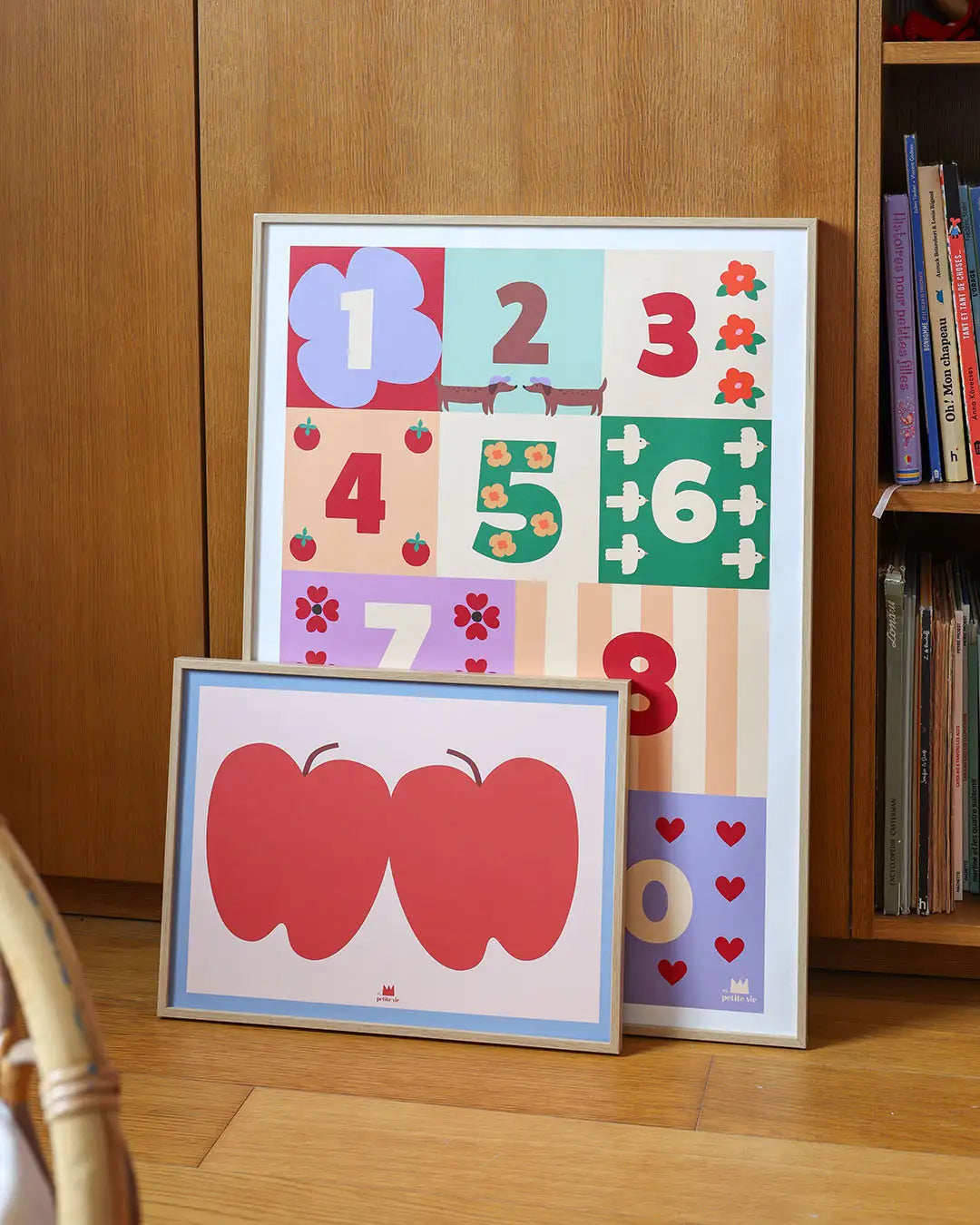
Learning, educational, or decorative posters: discover how to choose, place, and use educational posters at home according to your kids' age.
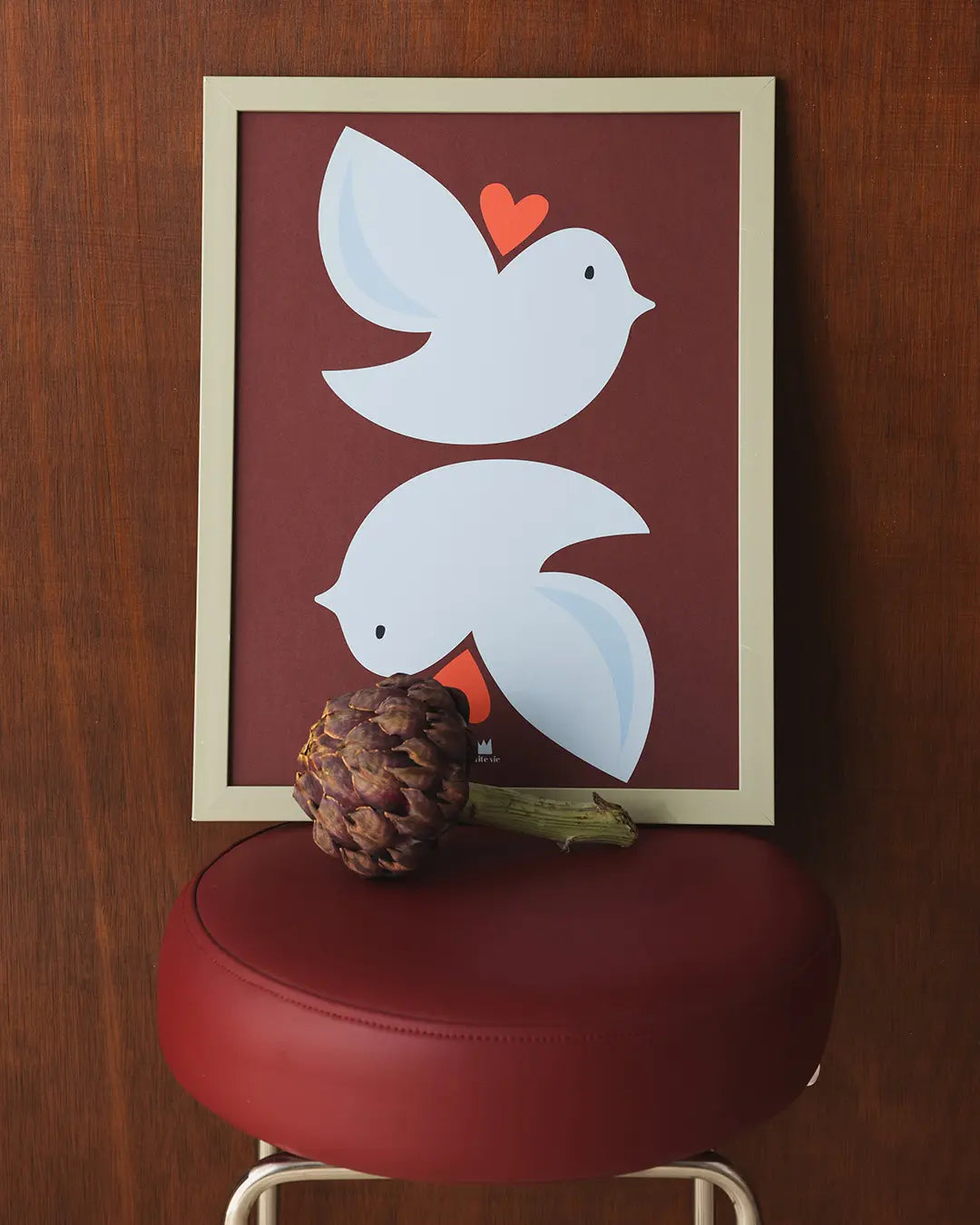
Framed or unframed poster: we compare the two options based on cost, appearance, and durability. Comparison table to help you choose wisely.