

Successful gallery wall: the complete method for combining your colorful posters (sizes, colors, arrangement)
Why format is the first decision to make
Before choosing your posters, even before thinking about colors, there's a question to answer: formats. This determines everything else. A failed decorative poster gallery wall is often a wall where no one thought about formats beforehand.
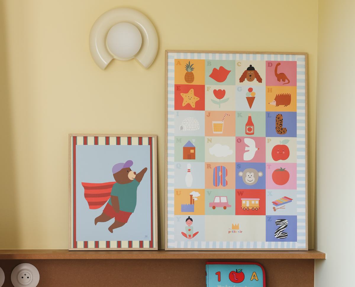
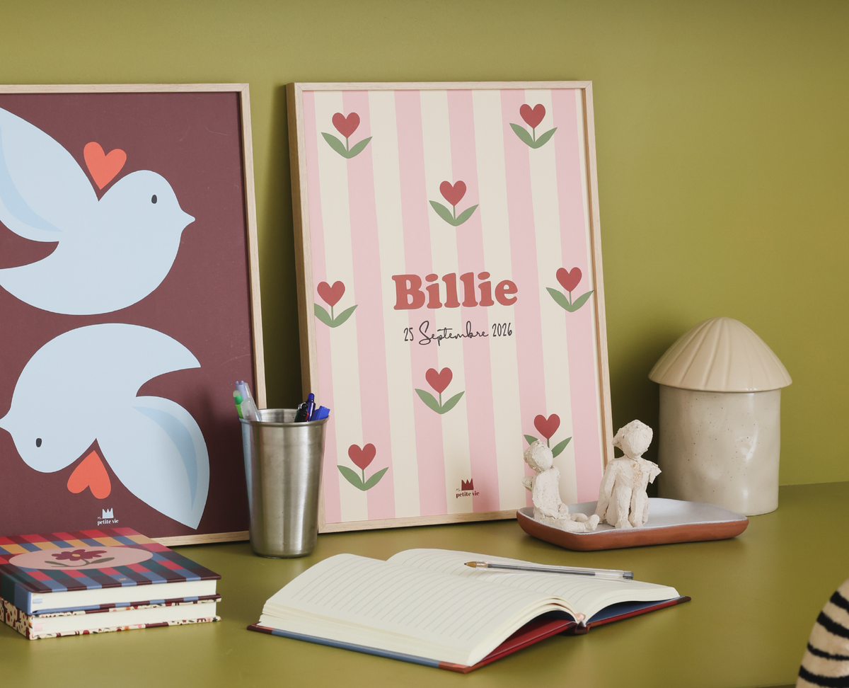
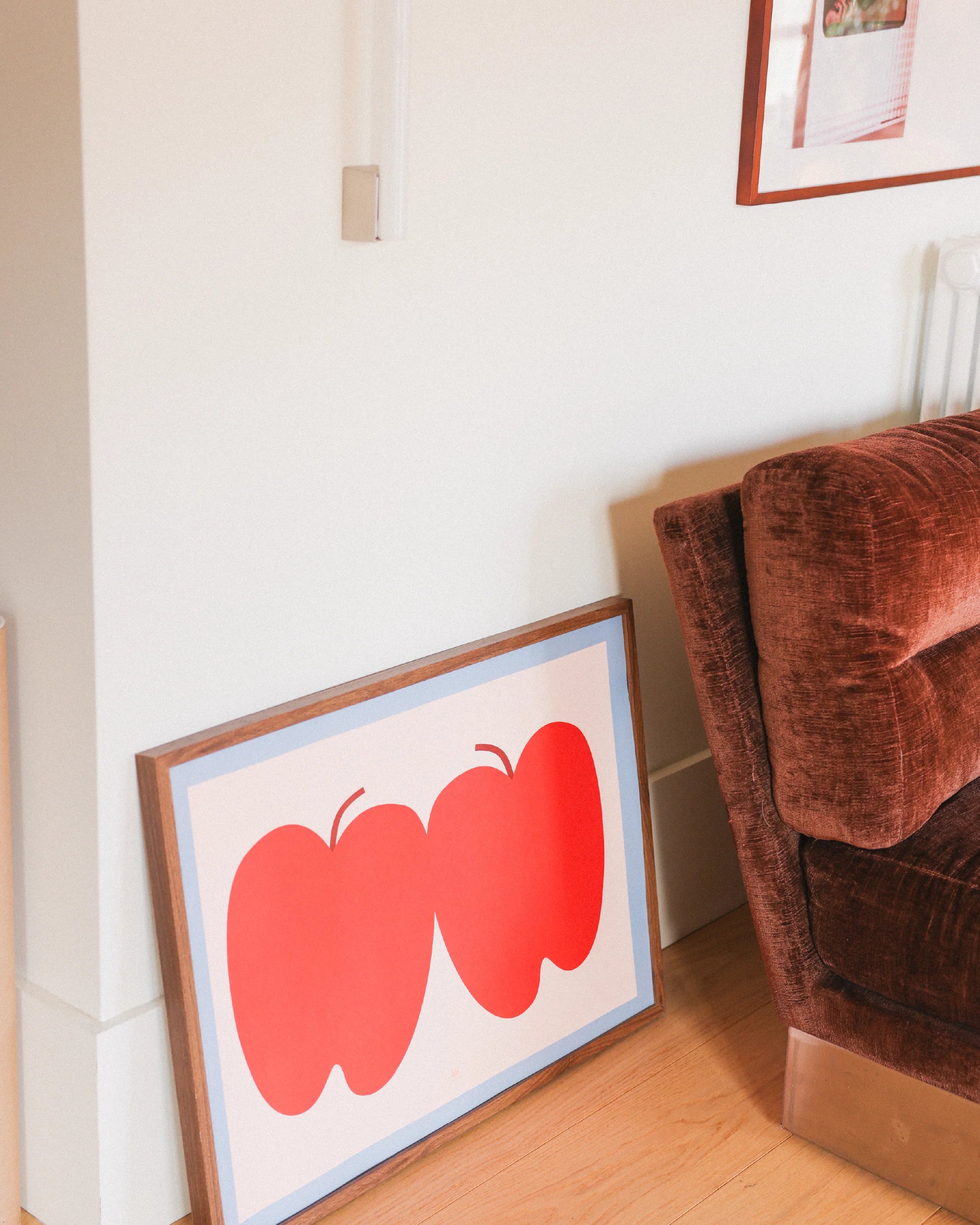
In our new collection, two formats structure most compositions. The 30x40 cm is the standard portrait format par excellence: versatile, it fits everywhere and perfectly accommodates illustrations like sun dog. The 50x70 cm plays a completely different role: it's the centerpiece, the one that anchors the entire composition and first catches the eye.
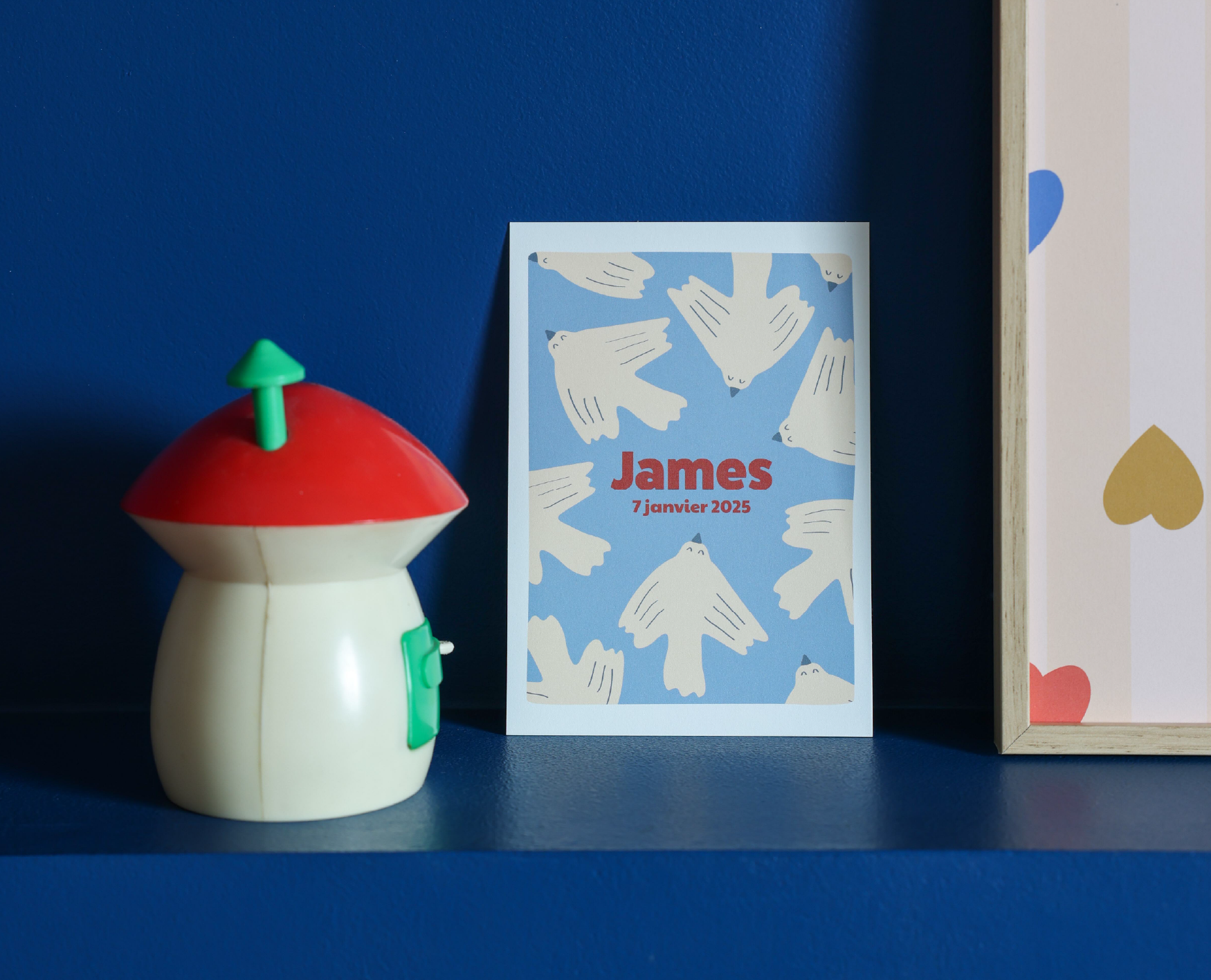
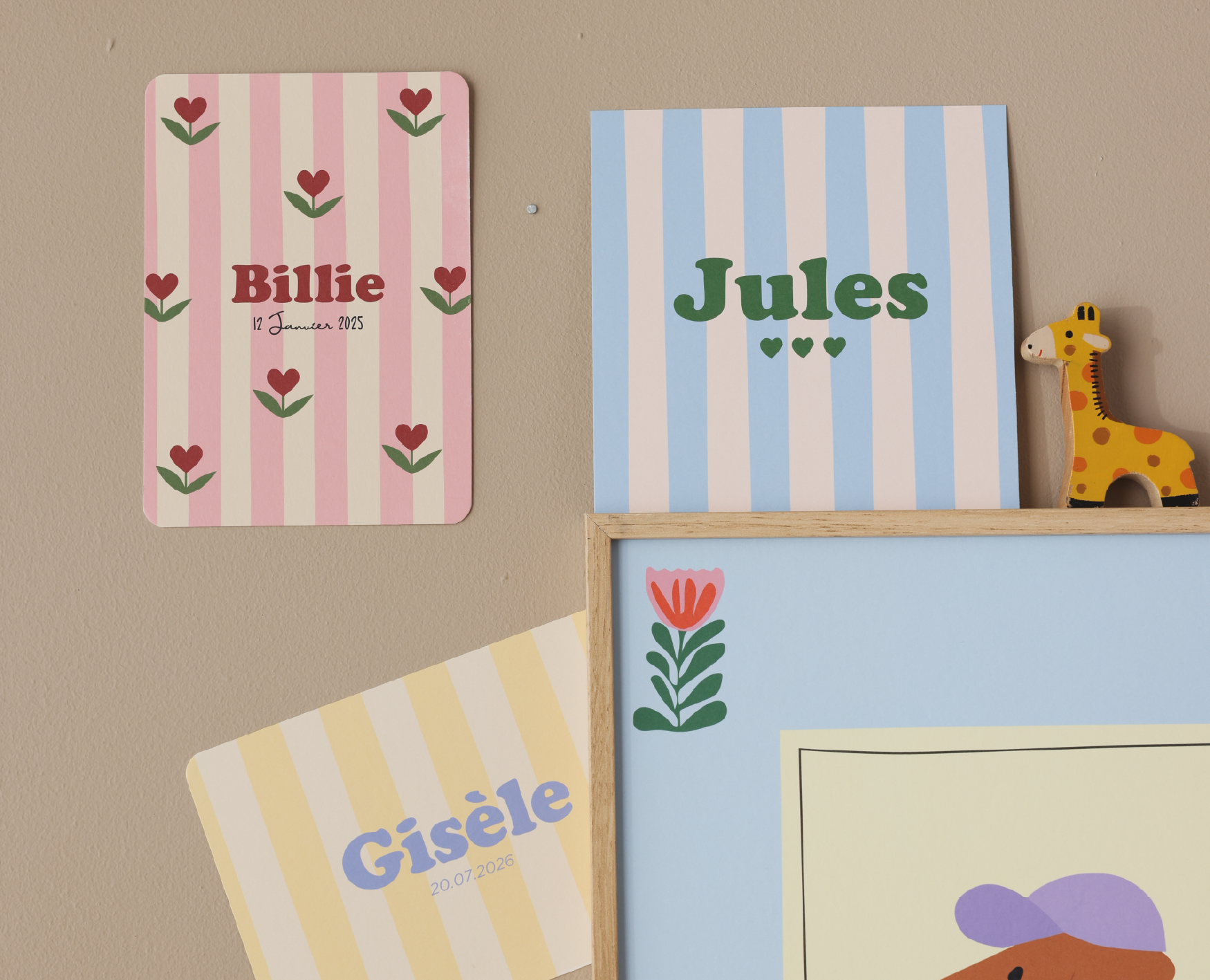
There are also small formats (our cards) that punctuate the wall lightly, like visual commas. They breathe, they balance.
Here's the simple rule to remember for creating a cohesive gallery wall: don't mix more than two different formats without defining a clear focal point. Otherwise, the eye won't know where to rest.
Building a robust color palette
Color is often where everything comes together. And often where everything goes wrong. The right method for successfully combining colorful posters? The rule of a maximum of three colors: one dominant, one secondary, one accent.
Specifically, if you start with a large 50x70 cm poster in warm tones, you can combine it with 30x40 cm posters in soft yellow, terracotta, or powder blue. These shades respond to each other without competing. For a truly mastered decorative gallery wall, don't forget the role of neutrals: the white of the wall, a natural wood frame, or a light mat play the role of chromatic breathing room. Without this "nothing," the whole can quickly feel suffocating.
Three benchmarks to keep in mind:
- One dominant color on 60% of the visual surface
- One secondary color on 30%
- A vibrant accent on 10% (a poster, a colorful frame)
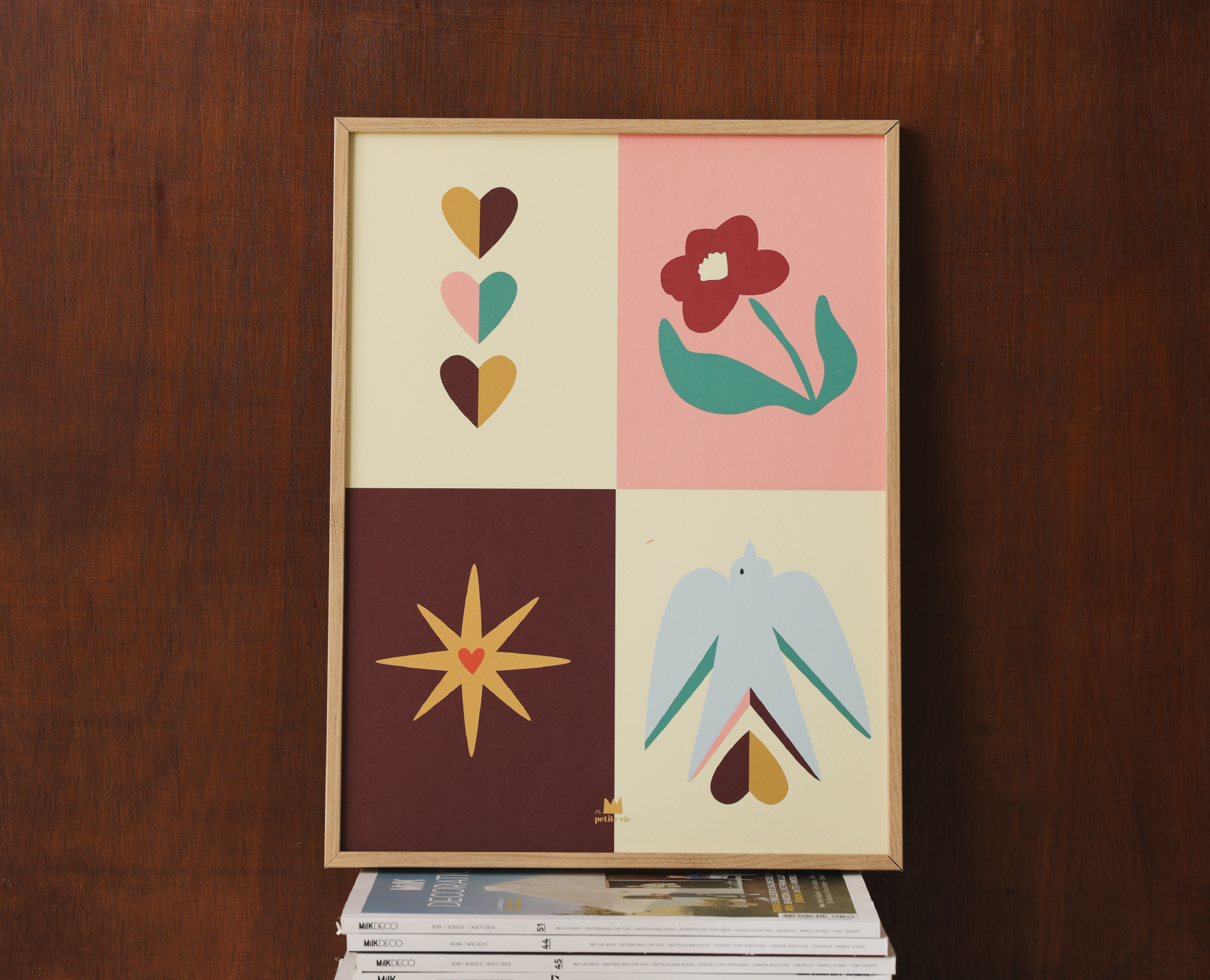
The large Peace & love poster is a very good example of a bright-colored poster that can serve as a chromatic pivot in a composition oriented towards warm and joyful tones.
Spacing and arrangement rules pros use
Arranging posters on a wall is something you learn. And once you know the rules, it's much simpler than it seems.
There are two main approaches. Central axis arrangement: all your posters share a common imaginary edge or center, which creates a structured and clean effect, ideal in a contemporary space. Organic arrangement (the famous "salon layout"): you lay everything on the floor before fixing anything. This method is more flexible and allows testing without damaging the walls.
For spacing, here are concrete benchmarks:
- 5 to 8 cm between each frame: the professional standard, airy and balanced
- Less than 5 cm: tight and dynamic effect, very graphic
- More than 10 cm: the composition fragments and loses its cohesion
To create a successful gallery wall, always start by positioning the 50x70 cm first, slightly off-center. Then build around it with your 30x40 cm, and then punctuate with the small formats. The pro tip? Cut kraft paper templates to the dimensions of your posters and fix them to the wall with masking tape before drilling. You'll be surprised how much difference it makes.
Three ready-to-use configurations by room
Because a concrete example is better than a long speech, here are three directly applicable configurations, room by room.
1. The living room: asymmetric composition. A 50x70 cm poster as a visual anchor, two 30x40 cm posters arranged in an L shape around it, and an A5 size card at the bottom right to balance the whole. This is the ideal configuration to create a true decorative poster gallery wall without it looking too calculated.
2. The bedroom: horizontal frieze above the headboard. Three 30x40 cm posters in soft colors, spaced 6 cm apart, aligned on their bottom edge. The lobster can bring a poetic and colorful touch to this configuration. For a child's room or a gentle atmosphere, also consider personalized posters, available in our home & lifestyle range.
3. The hallway: vertical column. Two 30x40 cm posters superimposed, spaced 6 cm apart, with a card interspersed between them. Simple, effective, and perfect for small spaces where the combination of colorful posters must remain light. This vertical format naturally guides the eye forward, which enhances the feeling of depth in a narrow hallway.
Common mistakes that sabotage a gallery wall
Good news: classic mistakes on a decorative poster gallery wall are all avoidable. Here they are, directly:
- Too many different formats without a focal point. The eye gets lost. Solution: limit yourself to two formats and designate a visual "leader."
- Too disparate colors. Each poster pulls in its own direction. Solution: choose a chromatic thread from the start.
- Irregular spacing. The composition appears unstable. Solution: use a tape measure and be consistent.
- Ignoring the color of the supporting wall. On a colored wall, some posters disappear. Solution: test with a paper template before buying.
If you don't know where to start, the simplest solution is to begin with a duo already designed together. Some sets combine posters and accessories so that coherence is integrated from the start, like the set available in our collection.
Frequently asked questions about gallery walls and decorative posters
What are the trending colors for wall decor in 2026?
Warm tones dominate: terracotta, ochre, rust, and camel are making their mark in interiors this year. They are found in good company with soft blues (slate blue, powder sky blue) and sage greens that bring natural freshness. These shades pair perfectly with colorful posters in vibrant tones, creating a soft and warm contrast. The trick: choose at least one poster in the dominant shade of the room to anchor the whole.
How to choose the right poster format for your gallery wall?
The 50x70 cm format plays the role of a centerpiece: it captures attention and structures the entire composition around it. The 30x40 cm is the versatile format par excellence, easy to combine and move. Small formats (A5, A6) come last, as visual accents. If you're starting out, begin with a large format and build around it. Explore the formats available in our new collection.
How many posters are needed for a successful gallery wall?
Between 3 and 7 pieces is the ideal range. Below 3, the composition lacks substance. Beyond 7, the wall risks becoming cluttered. The key: have at least one large format that anchors everything, two or three intermediate formats, and one or two small elements for visual punctuation. The golden rule remains variety of sizes, not quantity.
Read more

Choosing an original birth announcement for a girl, writing a touching message, anticipating deadlines: our complete guide with prices, examples, and practical tips.
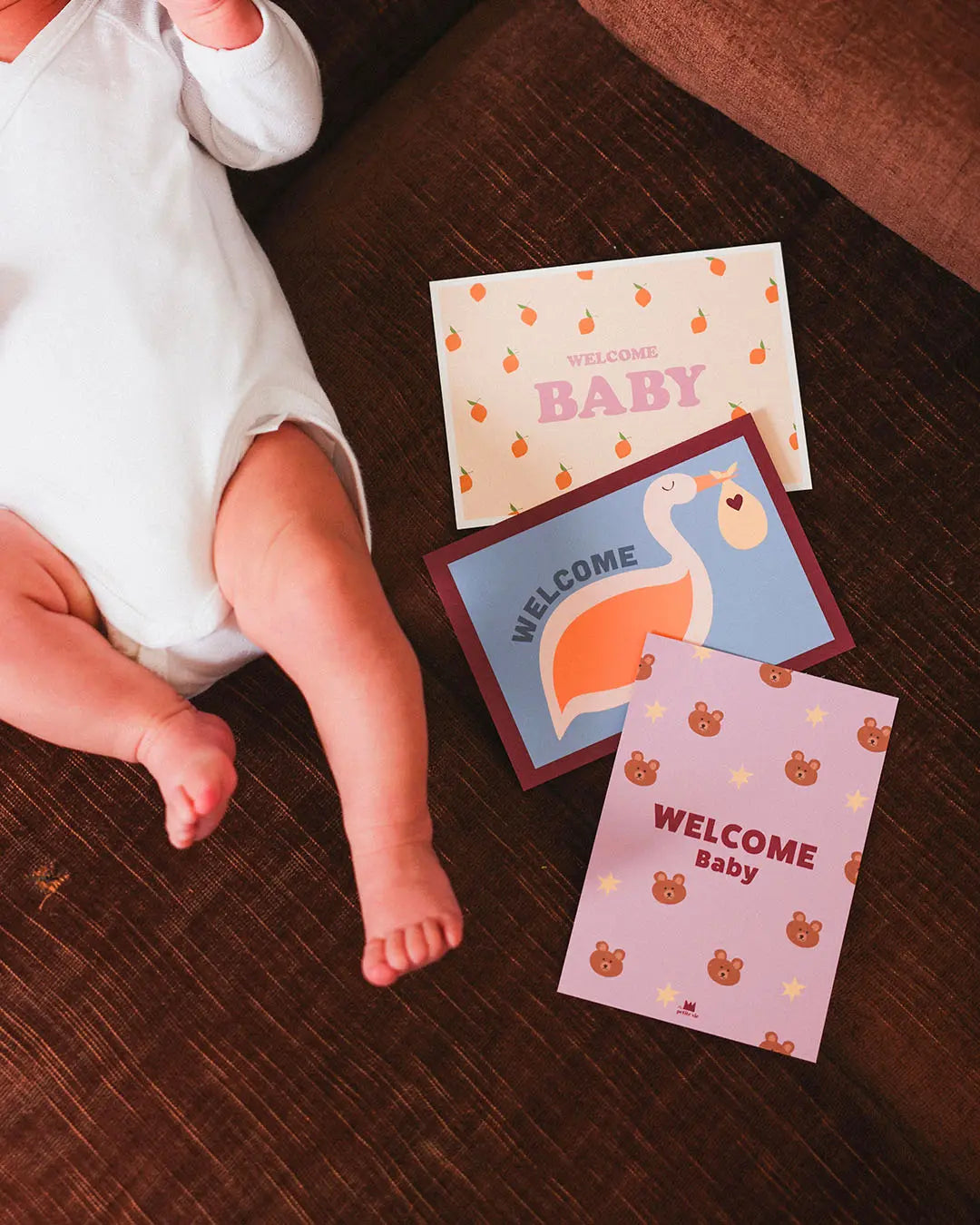
Girl birth announcement: how to choose the right graphic universe? Comparison girl vs boy, case of a second girl, texts and practical advice.